Archives

Showing posts with label Art/Design. Show all posts

I need a break

This has been the most stressful day of my career here at the firm. I accidentally truncated a table that removed everyone's leave records. Easily trumps the infinite loop issue I had back then by a big notch. This has been my biggest ~work~ mistake and I'm so embarrassed by it huhu.

We were able to restore a backup copy of the table but the data was only until 1pm today. I deleted the records around 5:30pm so that leaves us with 4.5 hours of data gap where I could only hope no one tried to request or approve leaves. I'm so close to asking those who logged in between that gap to know if they made any leave transaction. Just to remind them to file them again, cos you know, they're gone. And I just want to make sure. But heck I'm too tired and right now I'm just kindof wallowing in my mistake. I tried to look for the logs but wtf for some reason there are no logs for the day! I'm suspecting the app isn't logging prod transactions at all and it's so weird but I already got an idea. My goodness.

I haven't touched the system in 4 hours now and while a part of me wants to continue working, I don't feel like coding 'cos I don't want to make any more mistaaaakes huhuhu. May trauma paaaaaa huhu!

Gosh I don't even know what to work on next! Whew. This is definitely not the Friday I was expecting. I was looking forward to continuing working on my dev tasks. I was having fun. I actually think I'm on a roll, little did I know this snowballing mojo of confidence would be smashed by a careless mistake. I was working too fast, missing the little details, relying on muscle memory, trusting my productive streak. Heck I just got a commendation yesterday for deploying a robot and now this?

Man I deserved this right? I know I did. I was being complacent and too confident with my work. What a slap. As much as I needed this wake up call, I didn't want to affect prod data just to learn a lesson! Huhuhu

Anyway. I have so much to thank my teammates for and Lani too our server girl whom I called first to ask if they have database backup. My team mates swooped to the rescue and looped in my boss. Juskooo I wouldn't have the heart to tell my boss I did something wrong when I haven't fixed it. The horrorrrr. They reassured me everything's gonna be alright, we have backup, we'll definitely get a development database now.... but argh. Stuff like this just kinda lingers on me. And I just realized, in my 7 years of working, that I'm not mature yet. What would I do without my teammates' support and my boss' supervision. I'm a frkn child I could cry!

I'm still mourning for the data we may have lost forever. Huhuhu

Anyway. Here's a distraction. Trifold brochure design for one of my friends.


Happy weekend I guess.

Week in review

Monday

There are days when I feel so excited to go to work and do my job but when my boss isn't around I just tend to be more uhmmm lenient lol sssshhhh. It's true that when the cat's away the mouse will play. Not saying my boss is strict though, more like his presence errr encourages me to appear to work hard HAHAHA. Charot.

But hey, I accomplished something today. I'm finally 70% in this Holiday Staff Assignment page I'm working on in PHP. Next step is adding data validation. I might sayyyy, this task was pretty challenging. Duh, everything dev related is challenging to a QA (in my mind: what's happening to my career???).

So I have a table with checkboxes and input fields and on submit I need to collect the values from all the rows where the checkbox is checked and run an update query. The ideal approach (at least for me) is to grab the row values on checkbox check, and attach it to the value of the checkbox. That way, upon submit I could just get one list and everything I need would be there. But thennn, I'm trying to avoid onchange functions because I think it isn't too neat and I'm reserving the method for validation where it's more apt? Errrr.

Anyway, I managed to "cheat" my way into it by processing 2 lists and matching them together. Not the most elegant approach but hey, it can't go wrong.

Another thing I accomplished today was a logo project for one of my colleagues hahahaha. After retiring from writing on the sides, I badly needed more gigs. Right now I only have 2 logos, 1 invite, and one blog post. Man I need to keep myself busy.

Here's a reject, by the way:

Tuesday

Oh this day was busy. I had 2 RPA meetings. I didn't mean to be productive today but heck you know when there's a programming logic bugging your mind and you can't stop thinking about it? It's eating up my me time --- which starts by the time my boss leaves until the end of my shift hahahaha. Charot.

Here's another reject. Oooh I like it that my collection of "Drafts that didn't make it" is growing!


Wednesday

I got up pretty early so I had enough time for coffee. Oh I love coffee mornings. Moreso the fact that the time it takes for me to finish taking a bath is enough time for my coffee to brew and cool down a bit. Now I'm looking forward to more mornings like this.

I cooked butter tikka masala and bought naan from Queens. I really really love Indian cuisine (particularly masala, lassi, and samosa) but I don't like how long the smell lingers in our kitchen, our living, on our couch, AND IN MY MOUTH haha yesss even after brushing! I even feel like I'm giving off a scent as well HAHA.

Anywayyy. We played badminton today! It's pretty much my only source of sweat this week. I need to do this regularly!

Thursday

Cooked pork giniling today and I love it! Of course I wasn't able to cut down on rice, but well, I've been off track in pursuing a no rice lifestyle for so long so I don't care anymore! Hahaha

Today we had a short town hall with our regional chiefs, and one of them mentioned about the new building we're transferring to in two years time. I'm so excited! We're moving to Ayala Triangle Tower Two, which will also house the new Mandarin Oriental Hotel. The project is being developed by Ayala Land, of course, and the gorgeous building is designed by SOM. Here's thread from Skyscrapercity.

I'm sooooo looking forward to the new building I might actually stay until we move out! Not that I have plans on leaving lol.

Friday

I AM SO BLOATEEEED!!! Super lamon ako today! My husband got me kare kare with lechon kawali this morning before going to sleep, then I ate burger, pizza, and chicken at work. Also got coffee. I'm not even done digesting and I'm already craving for moooore. I'm just so hungry nowadays. My period's probably coming up.

Updates! I changed my blog layout a biiiiit. Just rearranged and colored a few sections lol


Uhm, what else. I wrote a new entry on my other blog, Surf & Perf. If ever you're working on UIPath and is interested with RPA. Check it outttt.

A Year in Design

Here's a recap of most of my design projects in 2018! Logos, invites, merch, and for the first time -- videos and branding. I'm learning goys yeheyy!
Logos

Smart Farms PH

This is one of those projects where I regret not learning Adobe Illustrator earlier. I should make it a point to learn AI this year haha. This would be easier in AI, but I'm more comfortable in Photoshop. Don't be like me.


Snapsolutely

This is so cute, I enjoyed this one! I didn't know how to create videos but the client gave a Youtube tutorial so I said I'd try. Here's the output! 


Wedding Invites

Rickett & Rose Anne


James & Monique


Other Invites

Bianca Nicole's Magical Birthday Party


Edison's The Little Prince Printable Party Kit

The Pinspiration is real on this one.


Branding

Quest Adventure Camp

Trifold Brochure


Business Card


Visual Brand Guide

I considered myself to be in a design rut when 2018 started. I wasn't doing much, not learning anything new. Until one of my friends asked me to create a business card for her company. I said sure. Then it got followed by a lanyard design, a brochure, a tarp, pens, notebooks, etc. And I'm like ohkaaay this seems like a corporate design thing, if I'm doing more of this I needed a brand guide. They didn't have one, so I made one. Scratch that, I learned to make one.

It's actually kindof weird for me to create one because it should be part of the logo design package (whoever made theirs), but nonetheless I had to make something for them otherwise the brand would be a visual disaster.


Merch
I only got interested in designing shirts when my Merch by Amazon account got approved. But it's been a year and I've never made a sale on the platform. It's a freakin saturated marketplace and I'm finding it troublesome to learn the ins and outs (for now).

FIFA World Cup


It was too late when I started making themed shirts. I was only able to finish Mexico, Brazil, Spain, and France lol. Check out the rest of them here.

Cat Holic


Never sold any of these but I had fun drawing them! More here :)

[Review] DesignEvo: Is this the Canva of logo making?


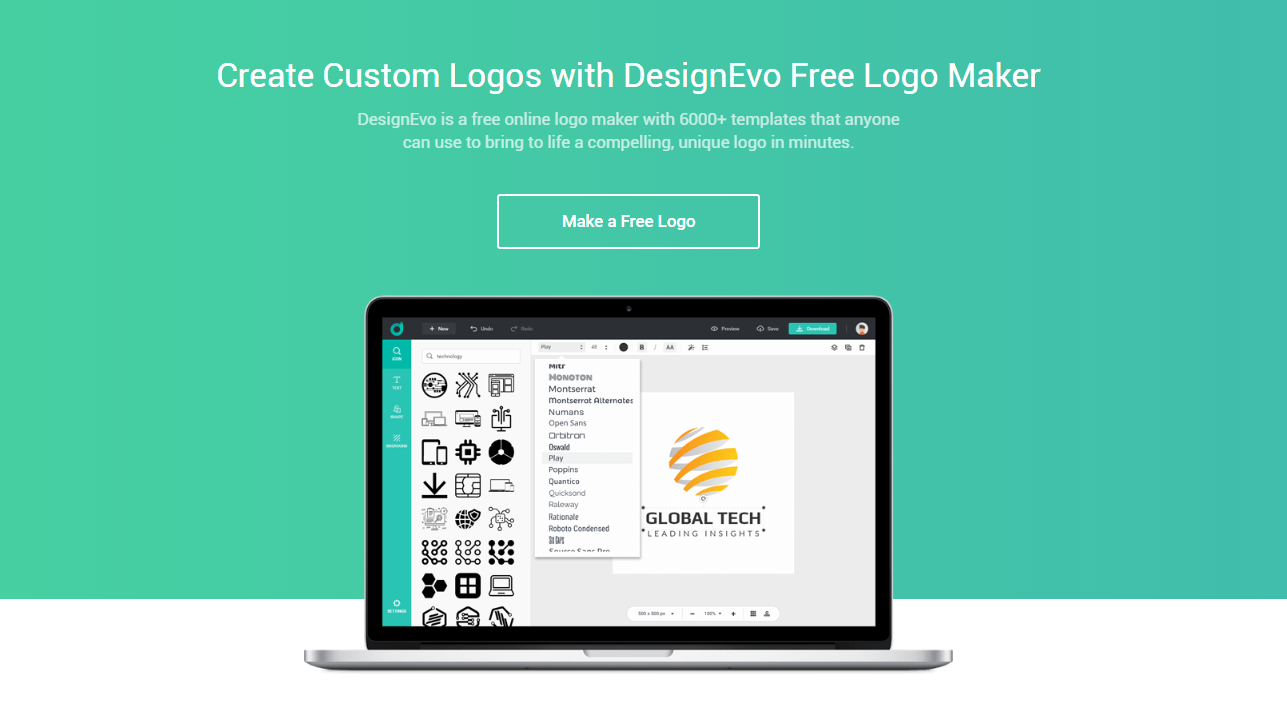
I was very excited when I found out about DesignEvo. The interface reminded me very much of Canva, a graphic design web application that allows users to create layouts and graphics using a drag-and-drop interface. With access to millions of photos, layouts, fonts, and graphic elements - it's my one-stop shop for quick design solutions. DesignEvo pretty much works the same way, except it's geared more towards logo making, something designers and non-designers would both benefit from. It's free, easy to use, and has relatively fair pricing packages should you want to purchase the logo you created.

To show you how awesome and simple to use this application is, here's a very quick logo project I created through the app. Aaaand if you want to try it for yourself, just head on to DesignEvo.com to start working on one.

By the end of this article I'd be giving away 3 100% off purchase coupons that you can use to buy a logo! Joining is easy, so please stick around! You don't need to join, I'm sharing the coupon codes at the end of this post!:D

30-minute logo design, is that possible? Oh yes!
Project: Logo for Surf and Perf
Brief: Surf and Perf is a small technical blog covering topics around Software Automation and Web Design. It used to be dedicated to Software Performance Testing alone (hence the blog name), but the owner starting dabbling in different fields of automation so the topics grew. The owner needs a logo for their website at www.surfandperf.com.

Keywords: quality assurance, web design, web, software testing

Preferences: simple, minimal, clean symbol

Process:

Timer starts now?

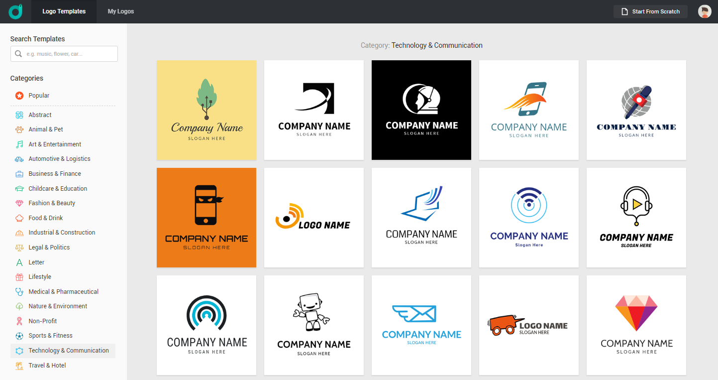
DesignEvo has tons of logo categories to choose from. But since we already established that the company is software related and technical, let's ignore the other cats and head straight to Technology & Communication


At this point, I didn't really have a concept in mind. I just scrolled through the many options and filtered those that struck near the keywords.

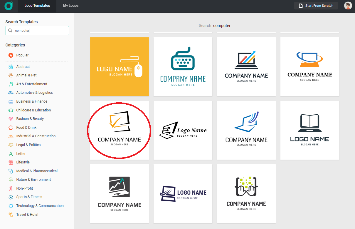
Aaand I stopped at this:


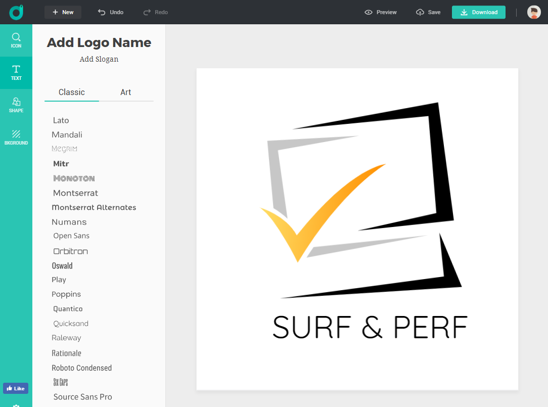
There were so many similar templates with a check mark and a computer but this one seemed most relevant because all the lines could stand for something.

✔  Check mark for quality assurance
✔  Computer for web surfing
✔  Brackets for coding/web development

I guess it was love at first sight. So I took it and started editing. The next step is really just a matter of placing your title text.


And we're done! How easy was that? You can choose from several fonts, and add shapes and backgrounds too. I didn't though, because the brief asked for a simple mark. Finally, you can download your logo by clicking on the Download link on the upper right corner of the page. Or for better appreciation, check out the Preview link first to see your design in several mockups.

 Looks legit!

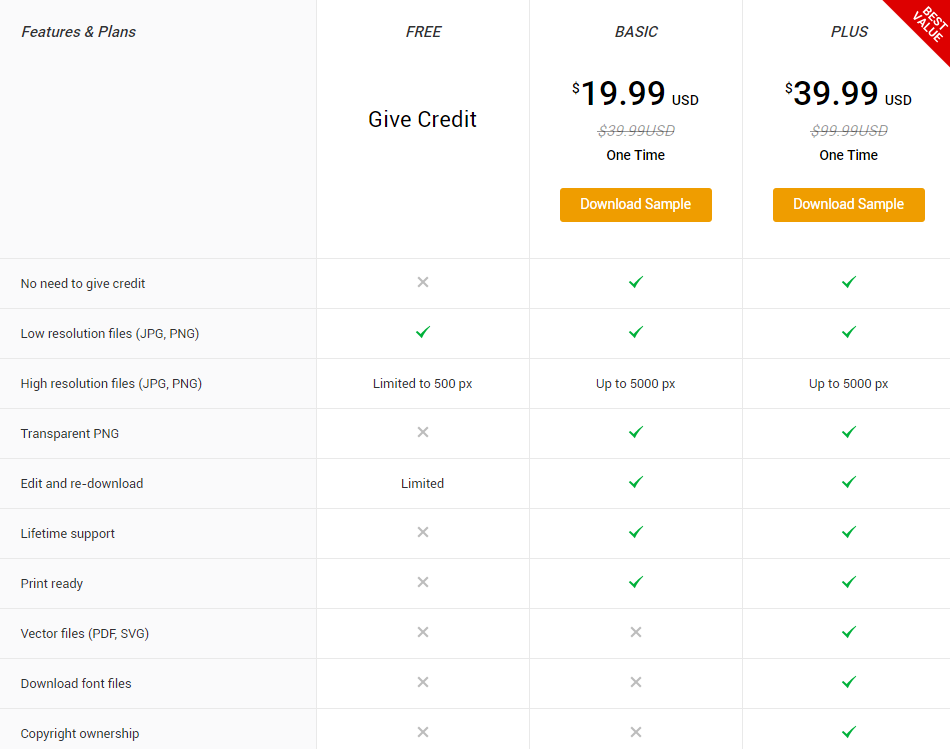
The checkout process is very simple. After clicking the download link, you'll be presented with  3 download options. 1 free and 2 paid.


The inclusions are all included there. For this project, I could very well just pick the FREE version because all I needed was to place it in a website, and that wouldn't take up more than 500px of space. But for demo purposes I got the PLUS version because I wanted to see the inclusions of the download pack.

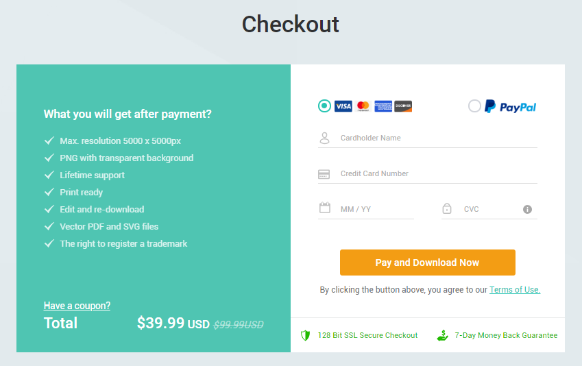
DesignEvo accepts paypal and credit card payments and you're guaranteed a secure checkout process.

FREE COUPONS TIME!

Here are 100% off coupon codes you can use at DesignEvo should you want to purchase the logos you created for free. I'm scrapping the giveaway mechanics 'cos I noticed it wasn't taking off so well, so might as well just give the codes to anyone who'd ask.

Each code is good for 3 uses, valid until December 31, 2018. And since it's all out here, first come first served basis applies. If the code doesn't work that means it's been used already.

Here you go:
DEP100FFHY1A
DEP100FFHY1B
DEP100FFHY1C

To use, just follow the Checkout page and click on the "Have a coupon?" link to enter the code.


Back to the download

As promised, the download pack contains a complete set of files you'll need should you want to further edit the logo.

✔  Font file
✔  Hi-res images (in transparent and white bg)
✔  Vector files (pdf and svg)

What I found missing though is the document file stating the right to register a trademark.

So finally, I would recommend DesignEvo for:

✔  Those who want to create a logo quick
✔  Those who don't want to pay too much for a logo
✔  Those who don't mind generic looking logos
✔  Those who don't mind public domain fonts 
✔  Those who want to look for logo inspirations
✔  Those who want to discover new logo trends
✔  Those who are just starting a business and don't have much capital on logo and branding

Having a logo for your brand/business is important, and DesignEvo offers a practical solution to that!

Don't miss the giveaway!

Unpopular Opinion: Graphic design pricing edition

Oh my gosh I'm so fed up with all these artists saying you should price your shit higher because

don't you have bills to pay?
have some self worth naman
you don't deserve that
you're dragging the industry down
they'll think all Pinoy artists are cheap
blah blah blah

... especially to young people who are obviously just starting out. I personally have nothing against those who charge less than 1k for their design services, if they're okay with it. It's not like they were forced right. I made 4 people their computer projects for 700 + snacks and I was happy that time. I was a student, their project was easy, so I made easy money, and snacks... and bonus points from my crush. But seriously, let's stop dictating other people's prices. That's not our business, literally. Cos honestly? There's a negligible chance of them stealing your market, unless you personally referred them. So why are you so damn affected by these bargain prices?

If you're really gonna insist these bills you so proudly factor in, you better make sure they're paying for them. Entirely. Not living under their parents' roof. Paying for their own internet. Computer. Legit software. Ha. I bet most of these really talented and "underpaid" artists are basking in the privilege of their parents' fortress. So what's left to factor in? Labor. Which is all up to the artist. So keep your noses out unless they specifically asked for pricing advice.
I'm not gonna say to anyone that heyyy your work is so good, that can't be just 500. Maybe if you made it, it's not gonna be worth 500 only, but that's you, so don't force your pricing matrix onto other people. If they're happy with it, the hell you care? Time will come they'll increase their prices on their own. So let them be mfs. If Paul Rand and I made the same exact logo, with the same rationale and process, you think the world would allow me to charge a million dollars for my work? Hell no.
This industry can't be standardized, at least from the pricing perspective.

My very first art commission was priced at 30 frkn pesos. That was 2006. I was a freshman. I made laminated playing card sized doodles. Metallic pen on black paper. How much does lamination cost then? 11 frkn pesos. Paper? Pen? I don't know, they're stock. Never mind that I never really profited from those. The fact that they appreciated my work made me so damn happy.

Fast forward to 8 years later, I illustrated a children's book. Pro bono. That's 30+ pages of digital illustration I spent sleepless nights to finish. Was it worth it? Definitely. Because it launched me. It was after the book launch that I gained confidence to set up shop.

And now I run a graphic design business on the sides, no pressure. I made sure to charge what my time and effort is worth. My baseline being my daily rate at my regular job lol.

I think what I really want to say is that it's okay to start small. Whatever that means to you.

Lettering in the Wild

So I was bored at work and I was browsing through random photography classes in Skillshare when I chanced upon this short tutorial by Jamie Bartlet about incorporating your lettering into a photograph via masking.

The result should be like this, where the letters are kindof blending into the scene and not simply stuck there like it would as a normal text. I hope I did it right though, I tried my best!


Here's a photo of New York skyline with its byline (taken from Unsplash.com). This isn't perfect and by all means I'm seeing all the sharp edges and fake overlays lol but I enjoyed this one and learned a lot.

If you want to take the same class here's the link to it: http://skl.sh/2lhCXk0

It's a premium class so you need to pay for it, but if you sign up using my referral link, you can get 3 months Skillshare Premium membership for just $0.99. That's the promo I'm using right now and I tell you, it's every well worth it, what with the amount of quality classes facilitated by incredible artists. Sign up now and start learning!

The class is a very straightforward Photoshop tutorial and I was so happy to have finished it in one sitting haha! It's been a while since my last Skillshare class so you could say I'm pretty pleased!

Jeckie has taught me about masking before but I've never really understood what it's for. I always get confused about that white layer you're supposed to scratch off or something. This tutorial definitely cleared things up. Highly recommended!

 Here are a couple of my other trials,


Hope you enjoyed this post! :)

Life Lately and a slur of random thoughts

❉ First of all, Happy Holidaaaays! Here's a square card for ya! The watercolor elements are part of a freebie pack at Creative Market. Font used is Trendsetter. :)


❉ Apart from that card I also made a couple of others after snagging some free design resources yey. Here you go:


Fictional couple, date, and venue.


This could be for us, I'm just experimenting with black. The date is set but the venue isn't final yet lol. What do you think? :D

❉ Most of my favorite lifestyle bloggers have not updated in weeks/months 'cos they're too busy travelling and posting snaps instead. Also, they're all kindof moving to youtube, doing this vlogging thing. Of course, I'm on to it too. Charot. But no really, I just ordered an HD webcam at Amazon via Uskoop (which is taking too long already...) so I could try vlogging too HAHA. I'll sell the thing if it doesn't work. LOL

❉ You know when you consider yourself an introvert and people think you like to be left alone in thought. And they think you're this kind of person who's really deep and shiz cos yeah, that's how quiet people are, right? Nope. I just realized I'm this kind of dumb quiet person who likes to be left alone. Just that. I don't really ponder upon things and humanity and philosophy and blah. Which makes me kindof sad. I always thought I was a thinker, turns out I can only think lol.

❉ On to the wedding preps! Thinking about my friends and family and the possible people I could ask to become our ninongs and ninangs, I realized that gooooosh am I really so withdrawn to people? Reading through my guest list I can see that oh wow I know A LOT of people, but when I ask myself if I want to see them on my wedding, I get second thoughts. Haha! Errr...

Truth be told, I want to get Oasis Manila as our venue, but it's just too expensive. I've already settled into a very simple theme, a simple gown, and a simple setup overall. But if we upgrade the venue, my gown will look too simple, my styling too weak, then suddenly we have to upgrade everything! Aaaargh. Bakit ba kasi ang gastos magpa-kasal lol. To be honest, if we weren't both paying for a car and a condo at the same time we'll be able to save up for a more bonggang wedding lol, not that I'm gunning for one but Oasis is really that lovely huhu.

❉ By the way, I started the HCG diet last week. What right timing no. I can't say if it's working yet but it does work as a fab appetite suppressant without the caffeine! I've been stocking on bags upon bags of frozen broccoli florets (from Landers!) too because part of the program is to consume a lot of greens and eat just 500 calories a day. I KNOW RIGHT. I'm killing myself again. But let me just work on this right now and see if I'll lose weight haha!

❉ I'm watching First Kiss for the Seventh Time and it's so freaking oppa overload! I hope they included Song Joong Ki though! I still don't understand how the story works and how ate girl became acquainted with all the boys but I couldn't care less 'cos it's only a short series and those men are but fantasies! Except maybe for Lee Min Ho who's not part of the cards! OMO <3 

So, if I were to pick just one of the 6... I'll probably choose Lee Joon Ki 'cos he's the one with the most realistic angle, he's a church oppa, and they (uhm, we. haha) go way back in childhood (who cares if I don't remember lol). 
  • Park Hae Jin is also realistic, but he's too workaholic for me. 
  • Life will be too dangerous with Chang Wook, though I'm tempted because who doesn't want instant martial arts skills? 
  • I don't care about Kai at all, I don't want to learn Chinese either. 
  • Hard to let Taecyon off because he seems so sincere, willing to give up everything he has, but then I didn't want him to break off with his family because of me (ang haba ng hair ko ok), and I also didn't want to get kimchi slapped. So, nope.
  • Oh and finally, I love Lee Jong Suk! He's just so charming and perfect and everything but it's gonna be a pain getting caught in his showbiz affairs LOL
Lotte Duty Free must have spent a fortune producing this! Waiting for Lee Min Ho's episode!

❉ Another thing I'm watching right now is The Legend of the Blue Sea starring Lee Min Ho and the immortal Jun Ji Hyun. It's so freaking hilarious! And LOLOLOL at Jo Jung-suk appearing and all the Jealousy Incarnate references HAHAHA. ♪ ♪ ♪ No no no no noooo ♫ ♫ ♫ I swear SBS is doing well with these unsuspecting crossovers haha.

❉ I wanna go home naaaa. I just filed for a leave tomorrow and the next day (30 is PH holiday but it's not in the US so... sad) even though I don't have enough leave credits anymore huhu but I don't care lol.

❉ This snowflake bullet is super cute.

Life Lately and look, an invitation set!

We're flying to Singapore next year!
One of my cousins is getting married at SG next year, and since it falls on my sister's birth month too, we decided to go for it for a double celebration! I got three tickets for my parents and my sister first. I told them I had to wait for the result of my US visa application before deciding if I could join, and because I got denied (more about it below), I booked myself a ticket na! But that's after waiting for another seat sale. I got a roundtrip ticket for 5k (yay?). Honestly, I still find it super mahal 'cos I still have to pay travel tax and terminal fee which is mga 2k din huhu. Juskolord ang gastos pala.

Anyway, if you want to score cheap airfares, just follow airline and promo pages on facebook, and set their visibility option to SEE FIRST. That way when you log in to facebook, edi you see them first haha. That's how I look up promos. :D

My 2nd US visa application got denied
To be honest I was surprised that I took this rejection lighter than expected. I even brought shades with me in case I come out of the embassy crying, lol, but I never got to use it. Anyway. As with my first application, I applied for a B1 (business) visa for the same purpose (client meetings) and for a shorter term (8 weeks, my last was 12).

My appointment was scheduled on a Friday at 7:25am. I was already within premises by 6:15am because I didn't want to get stuck in traffic. I parked at Ermita Center, which is nearest to the footbridge closest to the US embassy. You can park anywhere on that entire stretch. Parking fee costs 120 pesos (just 100 really but the bantays there said the extra bente is for kape kape lang lol) and you can stay until 2pm. Lo and behold when I got the receipt, it says 30 pesos for the first 3 hours. Those guys deserve some Starbucks coffee. Yung Venti. Wahaha. Pun intended.

I went in line around 7am and waited some 15 minutes before the guards started assembling people for the 7:25am appointment. There are placards showing which schedule is being served currently, and you have to wait for the guards to replace it with your call time before you can fall in line.

By 7:20 I was already inside the complex, queueing for Step 1: Pre-screening (or something). In which I handed the officer at the window my passport and guarantee letter. He asked for the purpose of my visit, then he turned to his computer to type stuff. After a while, he returned my docs and let me queue for the next step.

Step 2: Fingerprint scanning. In which I'm lucky not to have a menopausal pinay shouting at me to freaking straighten my fingers and dry them properly before trying again for the nth time. That window was scary.

Step 3: Interview aka the moment of truth, also where you should greet the consul with all the positive energy in the world. Joke. Here I was asked a lot of questions. I was also asked for a copy of my itinerary and my previous passport with my old visa. I was left to wait for a long time, and when the consul got back I was denied ultimately, saying I should consider applying for a different visa type instead. I would like to assume H (work visa), after all, my previous visa was annotated "B in lieu of H". Haizt.

I felt bad for the person waiting behind me, but worse for myself because I haven't even properly stuck my passport back to my envelope when he shouted SHAME! *ting ting ting* I mean, NEXT! K, last na yan.

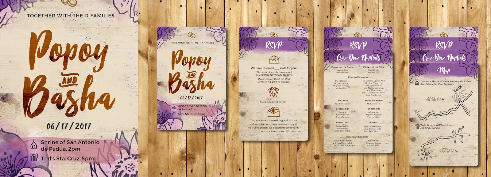
Just finished designing an invitation set!


It's the first time I designed a wedding invitation set so I really had to research on what goes into it. Apparently, ang dami pala lol. This is pretty basic, just four cards in total. The main card, RSVP, entourage and map. When I learned about the theme which is florals, purple, and wood... I knew it'll be easy for me! I'm also so happy to learn that the client loves it! Can't wait to see it printed!

Hire me! I'm all ears (and kilig) on your wedding! :)

:D

3 Step Watercolor: Painting with Layered Washes


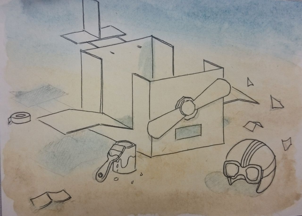
Here's one of my recently completed Skillshare classes, this one's FREE and is a really good one so go ahead and take it!

3 Step Watercolor: painting with layered washes by Renato Palmuti

The concept is to apply 3 layers of washes, from lightest to darkest and gradually add the shadows, highlights and details in between layers.

Materials used

Sakura Koi Watercolors
Canson watercolor paper

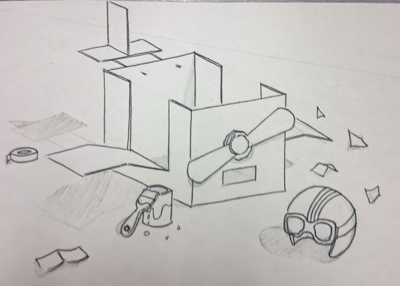
Drawing


Copying from the reference photo was very challenging for me. I think this one's off the grids and correct perspective but anyway, I had fun with ruler lol.

First Wash


Yellow Ocher for the light yellow parts and a mix with Burnt Umber for the darker bottom parts. Prussian Blue for the top and light shadows.

Second Wash


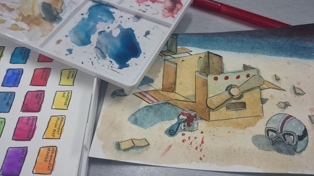
I took a photo when a corner of the box is still too wet. Added layers from the same colors, hereon focusing on the objects, defining more shadows, filling the top wash, and also adding some splatter to create texture.

Here's when I found "Trust the Process" to be applicable. At this point I was totally skeptic it would turn nice. I can't even get the shadows right and my colors keep on bleeding when they dry. My paper has also curled up significantly as I've brushed too much water on the first wash haha. But then I can see the layers and they're varying opacity as they're put on top of each other. It's pretty cute! Plus, teal and orange is a nice combo hehe

Third Wash


Here's where hope starts to take shape. We're to put darker shades, carefully placing where the shadows are. I only used one brush for this, the default medium waterbrush that came with my Sakura Watercolors. I think I needed a better one or I just need to learn to control my hand better. I can't seem to properly paint a straight line haha.

Details


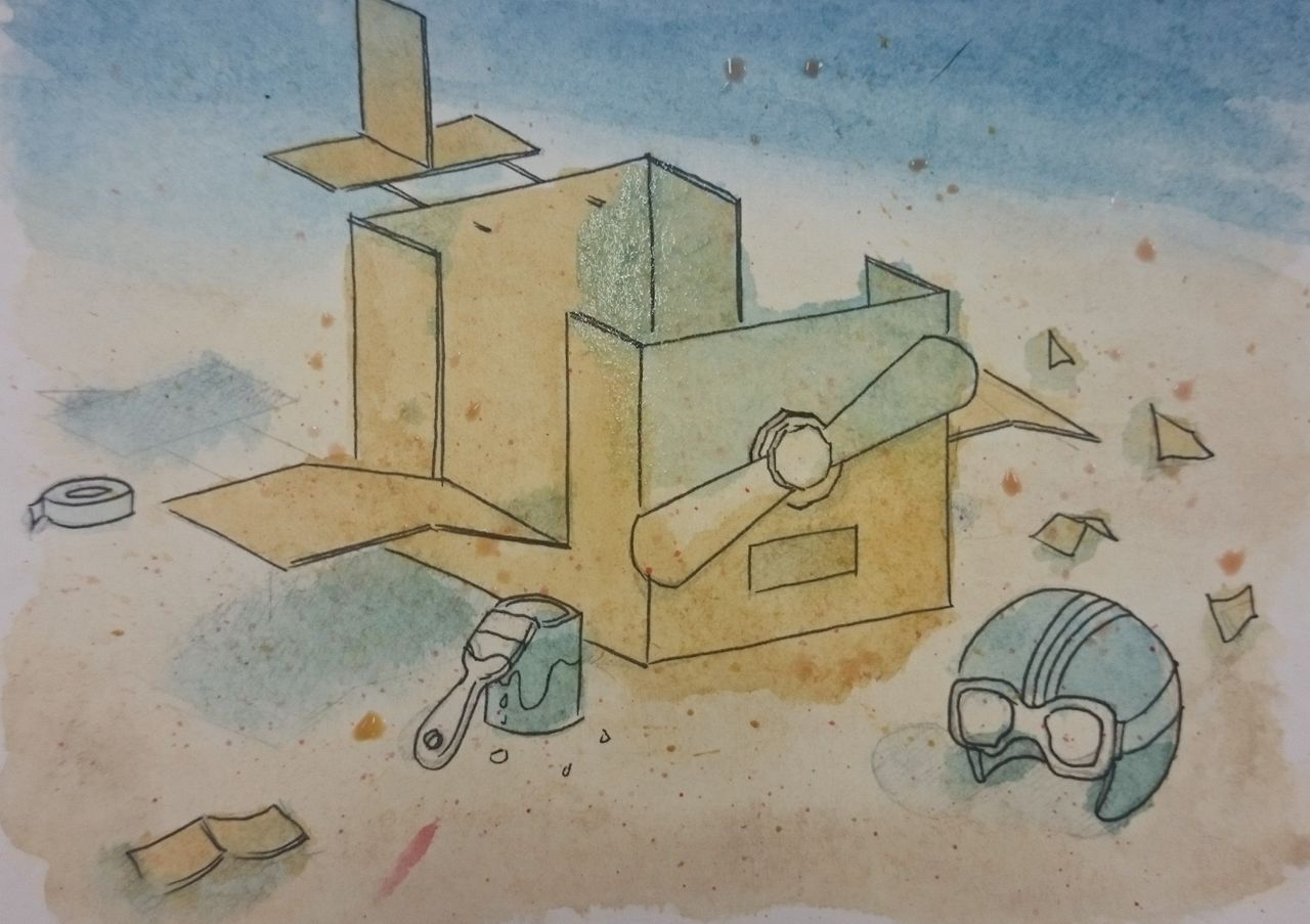
Finally, here's my finished project! Details added were the red and white lines and dots on the box, red paint and splats, helmet goggles and design. Highlights were also painted on some of the box's edges. I wish I had a more opaque white, but that's about the whitest Sakura Koi's Chinese White can get. Will probably invest on a white tube or a white pen. :D

That's it! I wouldn't say it's exactly the same as the original, but I did learn a lot finishing this exercise. From drawing outlines, to layering, and determining where to paint shadows. For the most part I just followed where the instructor puts the colors on. Hope you like it! :D

My better attempt at watercolor flowers

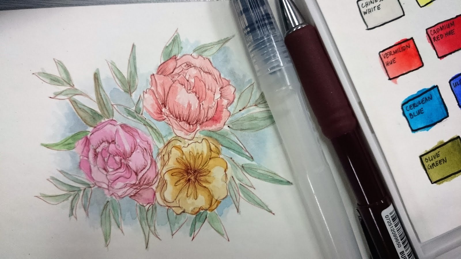
This is probably the prettiest I've painted so far, so I'm sharing it with you goys hehehehe.

Jenen!
Inspiration: this watercolor piece by Casey Ligon


I saw it featured on The Craft Central's Instagram page and I was so taken by it that I immediately pulled out a postcard sized watercolor paper and started drawing the flowers. I actually keep a stash of art materials in my office drawer in case I run into moments of inspiration, like this. 


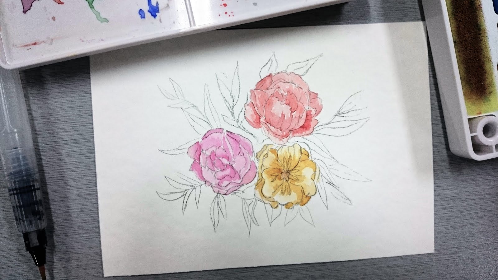
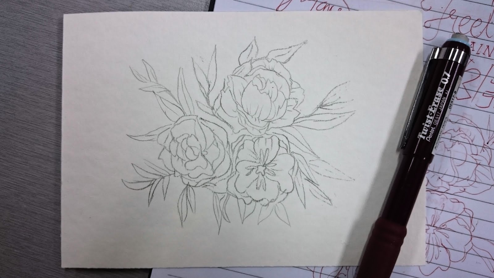
I know it has to be super light and it didn't have to be perfect cos it'll be colored anyway but I couldn't really spare the details. Drawing was my first love so I tend to over-illustrate things. Notice that I drafted the flowers first in my notebook using ballpen before actually drawing it on the vellum pad. I didn't want a lot of erasures on this one cos it damages the paper and could ruin the texture.

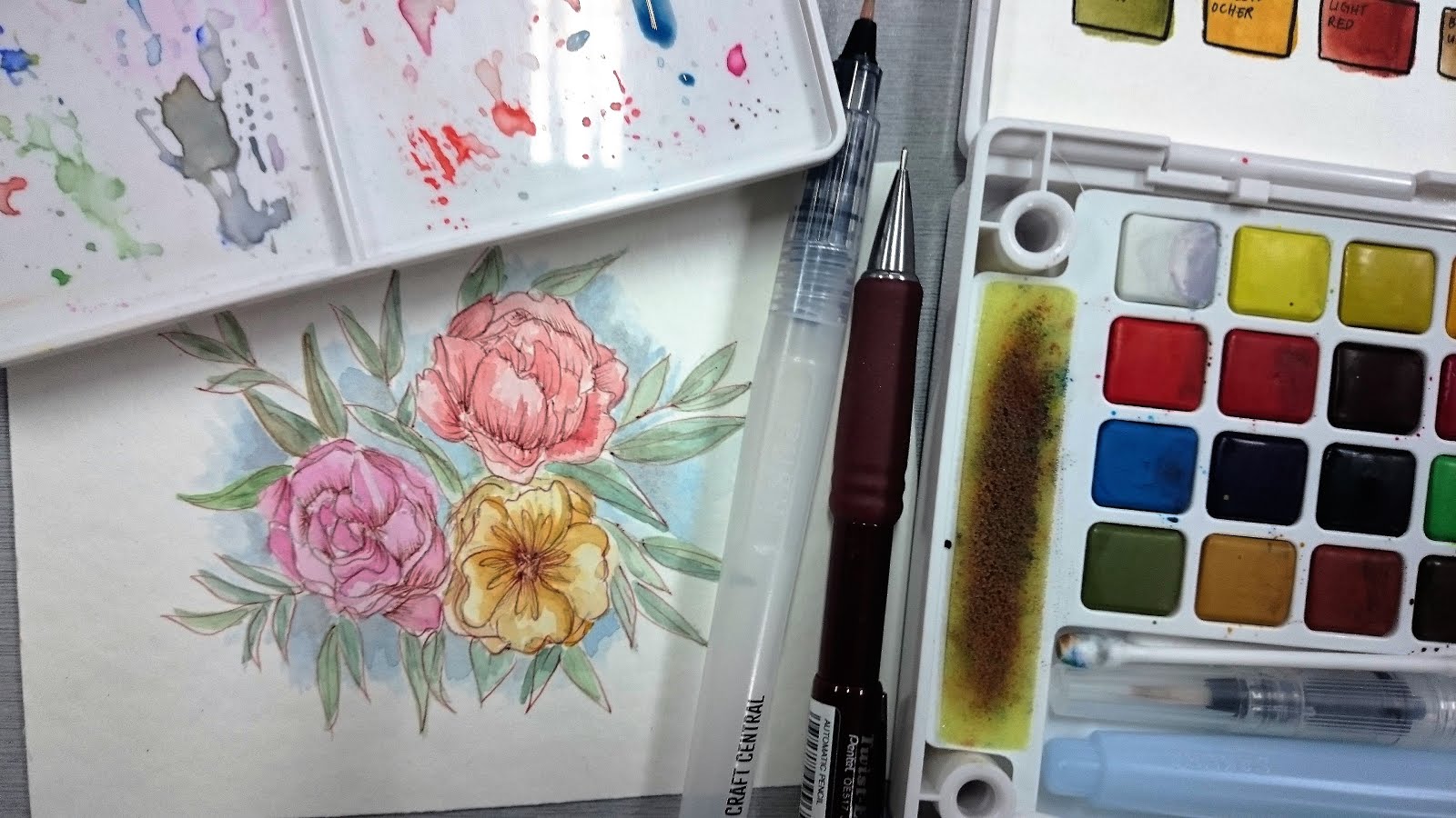
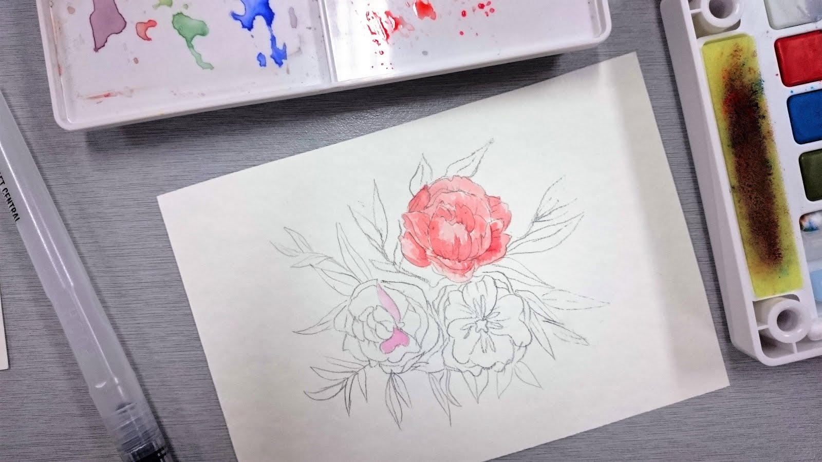
Then I started painting! For this I used a small water brush I bought from The Craft Central. For some reason the head doesn't dry out completely, it seems like water continuously flows through it as you brush. I thought it was a defect cos you usually have to squeeze the handle to release water once it's too dry. Mine doesn't seem to need any of that, but it's not leaking either so I let it go. It's very minor and didn't ruin my piece anyway haha.


I applied the colors layer by layer, starting with the lightest grade. I think the key to achieving this effect is to let each layer dry first before applying the next layer. I don't really know what it's called hehe. XD


After the flowers I went for the leaves. I did a mistake of making a darker green shade instead of just layering it so there are a couple of irregularly darker leaves somewhere.


Finally, I added a light blue background, erased the pencil outlines, and redrew them using brown Titus ballpen. Here's the final output:


Hope you like it! Looking forward to improve my painting skills :D If you have tips, tricks and know of super cheap watercolor workshops in QC, let me know!

What's on my desk?

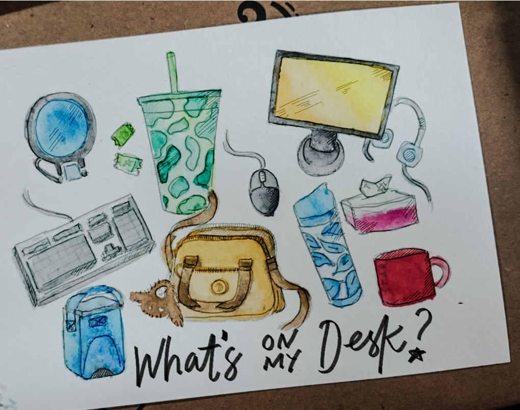
One of the Skillshare classes I'm taking is Kate Bingaman-Burt's Drawing Collections: Illustrating Stories through Taxonomy. In her class we are to produce a collection of illustrations that tell a story about ourselves. We are to make two sets; this is the first I came up with just by watching the first couple of videos and browsing the completed projects.

Finished output
In terms of following instructions, this output is totally wrong, but nevertheless let me take you to the process hehe

The collection I decided to draw was the stuff on my office desk, you're supposed to draw each item on a big sheet, add labels, color it using whatever medium, scan it, and post process it using Photoshop. After doing all those, you can combine and layout all of the items in a single large canvas and marvel at the story you've made a bunch of things convey.

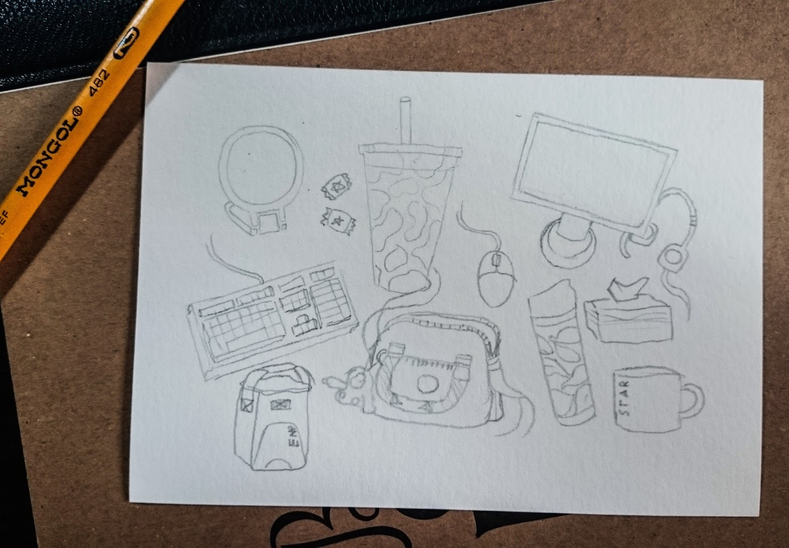
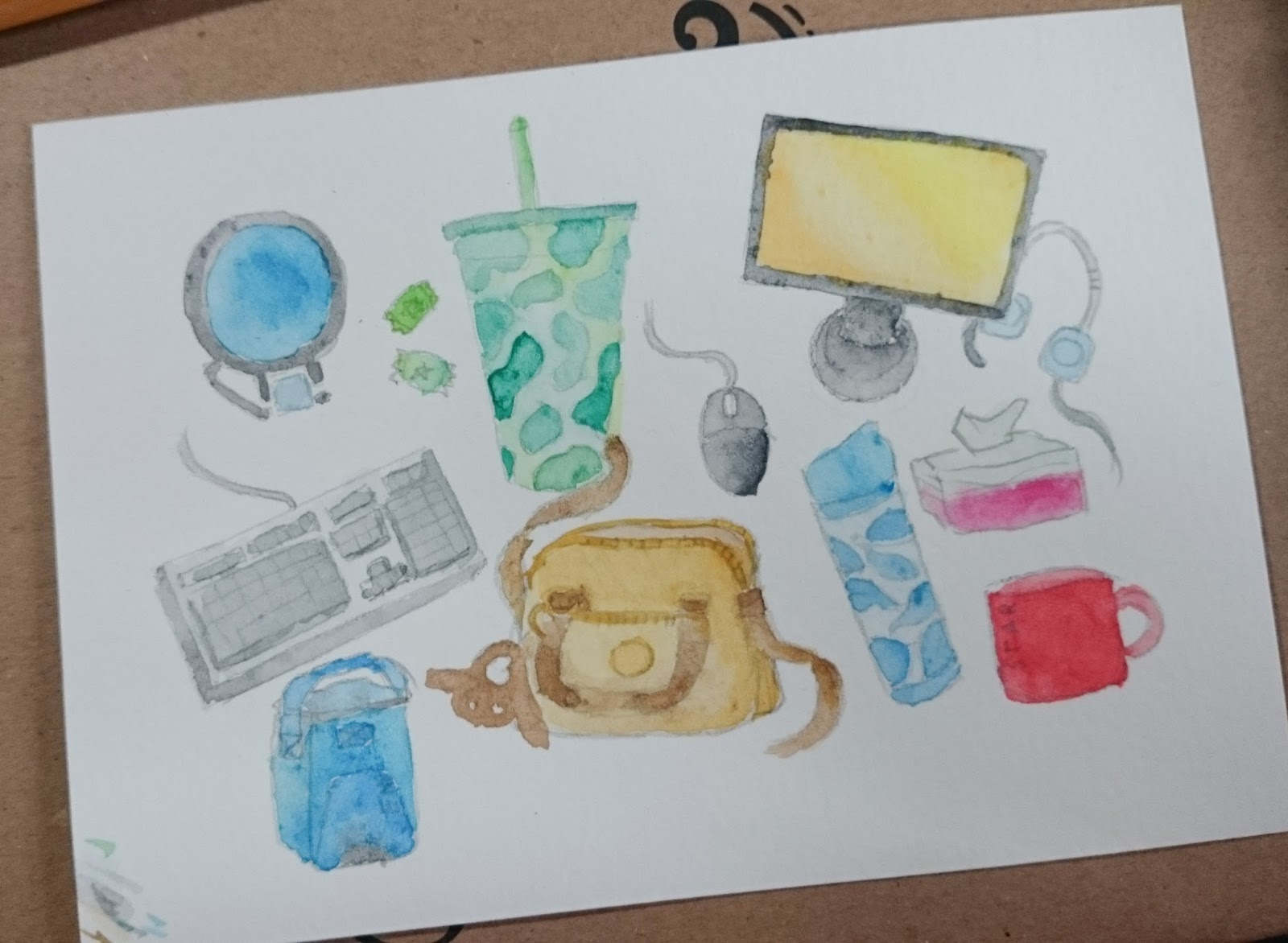
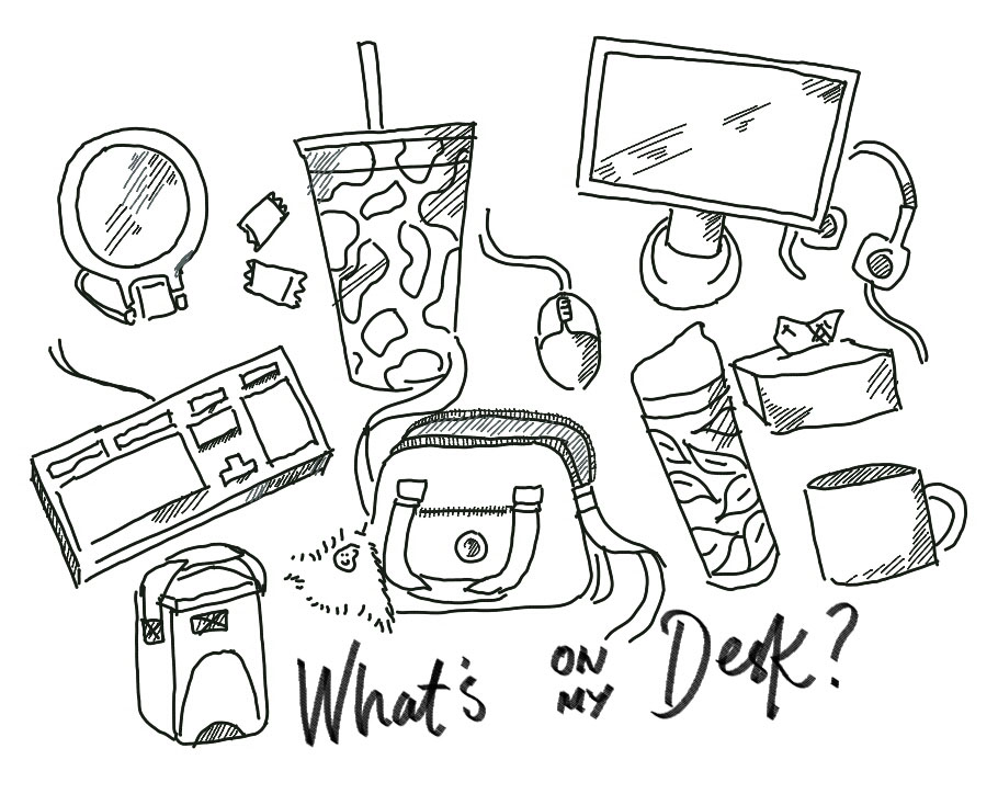
Sadly, here's what I did: I drew them all together on a postcard sized pad and colored the items using watercolor. Then I took a picture of it and edited using whatever app my tablet has. I forgot about the labels cos there isn't any space left.

Pencil outlines
Colored in using watercolor
Outlined digitally

I'm happy with the output, for one, it took me of out the creative slump I've always planned to escape from but never really got the motivation to. And also, I'm less afraid of watercolor now lol.

But then, I should have been more patient and watched all the videos before turning in an output.

Another thing,
There should be no shame in digital post processing, I know. But my finished work was more digital than traditional and sometimes I'm afraid of putting it out 'cos I would be ashamed to show the less stellar but original version. I don't know, but enhancing artworks using Photoshop feels like a stab to my creativity. Do models feel this way when their bodies are shopped for magazine covers?

I was very reluctant to apply filters and adjust brightness and contrast because I thought I will lose the integrity of the piece. But then I realized I was more afraid of screwing the piece by trying to enhance everything manually because there's no undo. :P

Case in point: I shouldn't care less

The case of the overly inspired

You know when you were way too excited about creating something, but for some reason ended up producing nothing, because you were too busy getting motivated and collecting inspirational material instead of working? That's the case of me and my Skillshare Premium account.

When I heard about Skillshare offering 3 months premium membership for just $0.99, I joined in agad and eagerly browsed at the many classes offered by outstanding artists. A month into it and I realized I haven't finished a class, let alone sat down and started drawing anything. So disappointing. I wasted an entire month jumping from one class introduction to another, adoring the trailers, the project galleries, but never enrolling.

Now, I want to make sulit the remaining months I have into actually finishing a class and producing something of creative value. Naks haha. Earlier I took the liberty to enroll in all the classes that interest me, particularly within the arts and design category, and grabe lang the joooooy of watching the video trailers showing snippets of the gurus' design processes and project outputs! Sobrang nakaka-inspire! Aaaaargh!

I'm calling this phase inspiration hoarding.

To the uninitiated, Skillshare is an online learning community where you can learn a skill or share your skills. In there you can take online classes about design, technology, business, film, photography, etc. and engage in a streamlined learning process in order to complete a class project.

Here are the top 5 visual arts classes I'm most excited to start (in no particular order), but will most likely ignore for the majority of the week (or month) cos that's just how I roll (unfortunately).

1. Mastering Inking: Basic and Pro Techniques
by Yuko Shimizu
http://skl.sh/1MQEysJ


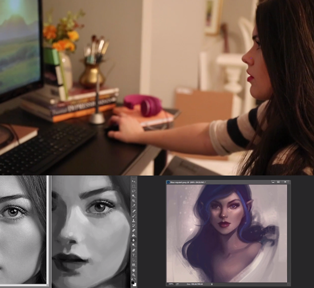
2. Paint a Portrait in Photoshop: Blank Canvas to Finished Illustration
by Gabrielle DeCesaris
http://skl.sh/1RWNrjx


3. Drawing Collections: Illustrating Stories through Taxonomies
by Kate Bingaman-Burt
http://skl.sh/1MQzXGY


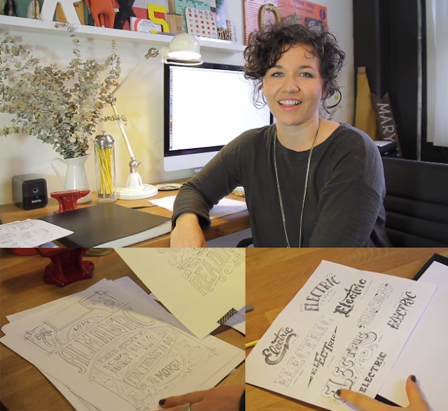
4. The First Steps of Hand-Lettering: Concept to Sketch (Lettering I) 
by Mary Kate McDevitt
http://skl.sh/1Wanq3j


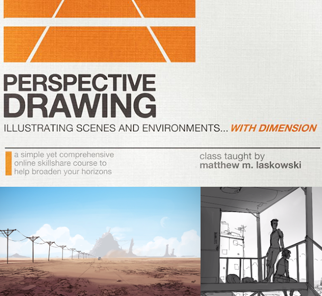
5. Perspective Drawing: Creating Illustrations with Dimension
by Matt Laskowski
http://skl.sh/1MQEucq


To be honest, if I hadn't spent time working on this post I could've finished a class already but who cares! We all know my time's gonna be spent somewhere else like my Pinterest boards or, oh right, my job. :P

Join me!
Let me get you in the same offer and let's marvel at all of the classes together. The truth is if you join by being my referral, I'll get a free month! Yay! And you will too if you join and refer. :)

$0.99 is roughly ₱50 for 3 months access to premium classes. Most classes run for an hour which is divided into multiple segments per topic. If you take at least one class per week, you'll be able to finish 12 classes and produce 12 creative outputs! And your monetary investment? ₱50 lang, bongga.

Here's the sign-up link: http://skl.sh/1R0xxpl
Or you can also comment your email address so I can invite you another way. :)

:)