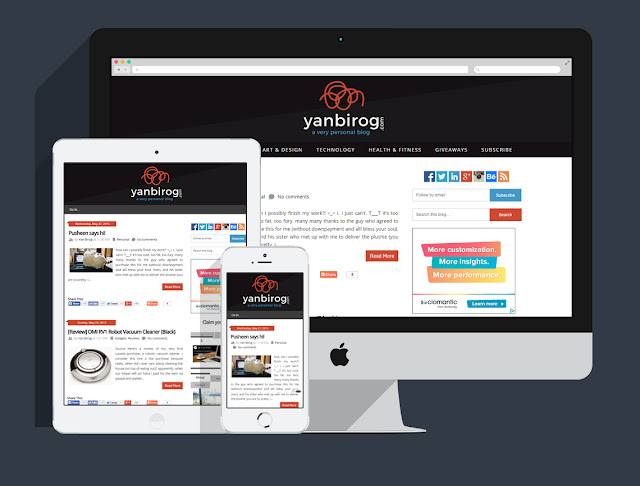
i'm calling it Squarespace cos it's what pushed me to change the header. hehe was playing with it earlier and thought... ooooooh that will look good on my blog! you should check it out, it's a pretty neat logo maker. :D
Original theme: Ribbon from New Blogger Themes (i'm so proud at how different it is from the original now haha)
Header logo: mocked on squarespace/logo, recreated on photoshop; scribble icon from thenounproject.com (aaah icons galore!); font used - monserrat (it's free!);
 |
| ooooh i'm loving flat mockup templates right now <3 |
Why the scribble?
i really don't know, it's appealing to me. it's random and could pass as a signature too. ano raw.
How about the colors?
i have no preference whatsoever. i took the scribble's and blue text's hexes from the G+ and LinkedIn icons respectively.
What's next...
i fancied the tabber widget a lot because i used to have a really long sidebar and i wanted to compress them somehow. it provided a beautiful solution BUT an inefficient one as it gravely affected this blog's loading time. :( and look, i have four frkn tabber widgets pa and all the scripts are inline so that's pretty heavy for a blog. T__T it looks messy too, code-wise.
i'm going to clean it up one day, decide which sections i could remove... and and... yes. i should get back to work. >_<
